Amberly’s Place unveils refreshed logo

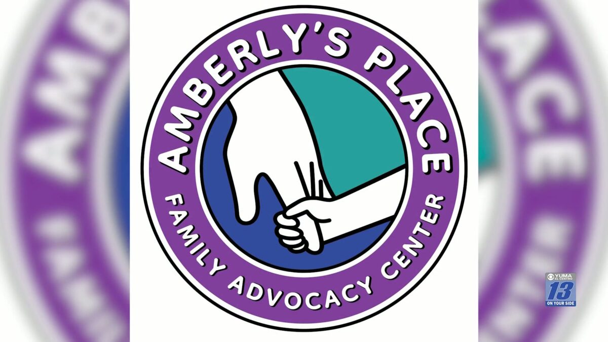
YUMA, Ariz. (KYMA) – Amberly’s Place has unveiled a refreshed logo to honor their 27 years of service while also looking to the future.
The organization said this began after they entered the New Year, New Yuma contest last December, which was “an opportunity designed to provide a local nonprofit with a refreshed visual identity.”
After reviewing organizations throughout the Yuma community, Amberly’s Place said the contest selection panel chose them as the 2026 recipient.
The new logo design, according to the organization, remains “connected to the history and heart of Amberly’s Place while reflecting the organization it has grown to become,” and said it incorporates three of the following colors:
Purple: domestic violence awareness Teal: sexual assault awareness Blue: child abuse awareness
The new logo also keeps one of the most recognizable elements of their original logo: The child and adult hands, the organization said.
“While the organization’s visual identity has evolved, its commitment to victims and survivors remains unchanged,” the organization expressed.
Click here to follow the original article.